If you’re subscribed to our monthly newsletter you’ll know that Pandle HQ is filled with busy bees working away on a brand new redesign.
We want to create the best experience for our users, so we’re having a major user interface restructure, where we’ll be implementing new features to improve your Pandle experience.
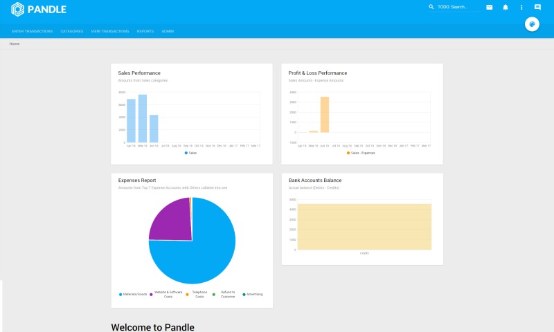
The change will mean an improvement of all the bits of the software you interact with, making Pandle quicker, more intuitive and generally easier to use.
Redesign run down
A complete overhaul of the way you use Pandle is coming, but don’t fear, we promise it’s going to be better than ever.
For those of you who are frequent Google users, the redesign won’t look completely alien. Pandle’s new theme will resemble Google’s latest projects, so you won’t be left wandering into the unknown.
You’ll also be able to customise Pandle to your own tastes, making it easier for you to navigate and get on with the really important stuff, like creating and sending invoices, updating your bank feeds and generally keeping an eye on your business finances.
The work currently being carried out by the team will also mean that we can easily update the UI in future so other work won’t be delayed.
Dates
While we can’t give you a specific date yet, the redesign is expected to be completed in the next couple of months, but don’t worry – we’ll keep you updated with any new information.
Feeling left out? Sign up to Pandle for free now before you miss any of the good stuff!
Excited? Tell us your thoughts on the redesign in the comment section below
